Oh happy color…

Long time user of Happy Color. It’s so good. Color by number is just perfect for me.

But of course it’s not a perfect app. Here are a few issues.

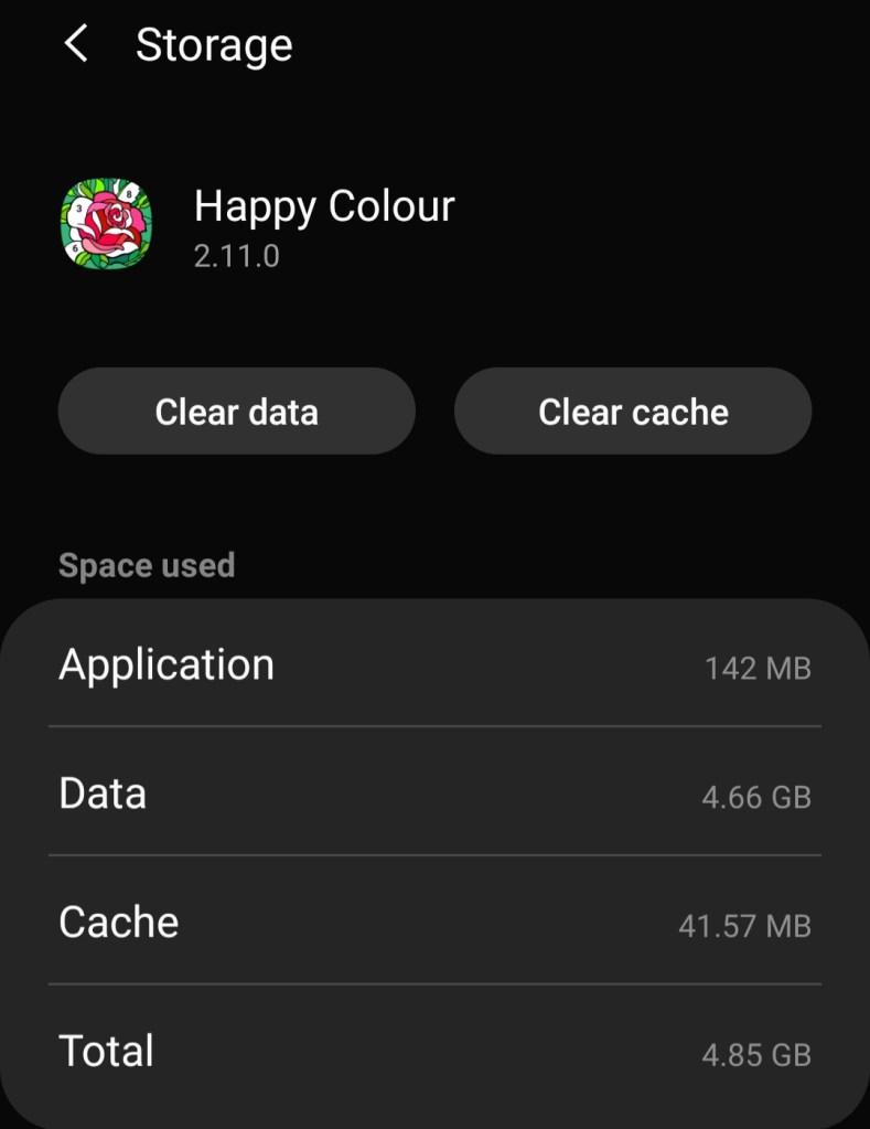
1) Apparently each completed puzzle takes up a certain amount of space on my phone. And when you’ve completed, I don’t know, 10,000+ puzzles, it’s a lot of space. On top of that, a lot of completed puzzles means that some of the operations in the app take a long time. They all seem to be “show some puzzles”. As if it takes a lot of time to filter out the completed ones? I’m not sure what’s going on here. I know that enough information is stored (on the phone, I think) to show an animated puzzle, and it would be fine by me not to store that, if it would save time and space.

In my case, there was 4.66 GB of data.

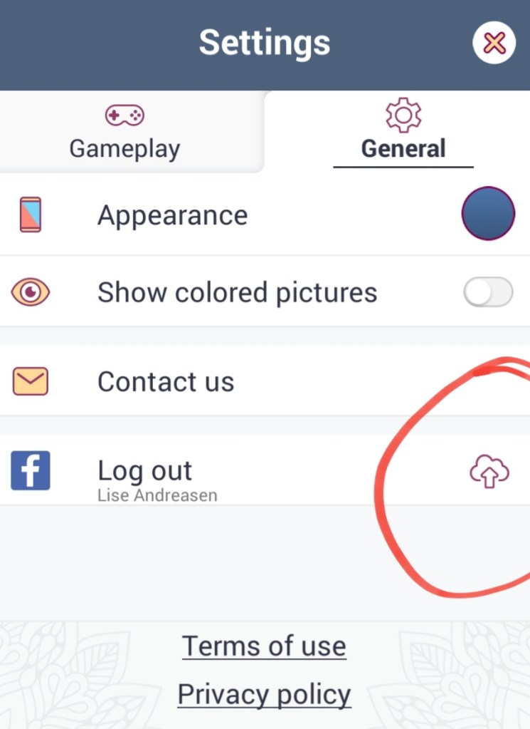
2) The app has a mechanism to backup and restore progress in the cloud, including moving to another device. It barely tells me that a sync is going on. I don’t know how far along that sync is. 10%? 99%?

Sync in progress.

3) There are a lot of categories of puzzles. But some of them don’t make sense. A puzzle that’s daily + animal only shows up in daily. Same for bonus + animal. Solved puzzles can be removed from most of the category overviews, but not daily, making it very hard to navigate. Because nothing can be found via dates. At this point, instead of having one tab for every category (there are about 20), there should be tags. Then I could configure which tags I want to see always/never. And daily and bonus shouldn’t be special. And configuring for time period would be nice too.

4) I find that the “good” puzzles are hard to tell in advance. Number of cells and size of smallest cell and number of colors all matter, but I have to guess at these numbers. Showing these numbers and letting me configure which ones I want to see always/never would be a great help.

5) I usually color each puzzle, one rectangle at a time. I have to do the zooming and the moving around by hand. It would be so great if the app helped me.

6 rectangles.

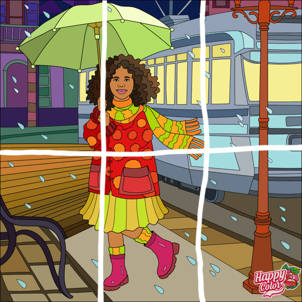
How I color the puzzle.

Crunch Time, bad design

I’ve already complained about commented on the design of Bee Brilliant. Crunch Time is related and has the same problems. And then one more.

I’m playing this game because I’m a fan of the short movies. Nothing wrong with them.

Very often I play the daily quest. I succeed. I come back to the list of quests to get my reward. But!

Something very important has to be announced first!

See the cat icon in the lower left corner? It’s there because the background is moving. Because Very Big Announcement is doing all sorts of things, behind the list of quests…

Wish har stavefejl

Bouncy! er et sjovt, lille program, men det er ikke det, vi skal tale om i dag. Det interessante er den lille reklame forneden.

For det første bruger Wish geografi til at beslutte sig for et sprog, i stedet for det anbefalede: det sprog mobilen i øvrigt taler, i mit tilfælde engelsk. Tsk, tsk, tsk.

For det andet har Wish ikke givet sine oversættere information nok. Jeg ser for mig et regneark, der bl.a. siger:

  • English: install
  • Dansk: _____

Og så skal oversætteren taste det rigtige danske ord ind.

Det tager ikke rigtigt højde for, at “install” har flere betydninger.

  • To install a program. = At installere et program.
  • Install the program! = Installér programmet!

Oversætteren har tastet den første mulighed ind. Og i den lille reklame var der brug for den anden mulighed.

Ak ja.

Bee brilliant, bad design

I like Bee brilliant. I really do. Most of the time my victories are rewarded by little songs. Love it.

But opening the game is a pain.

This is an ad. For something random apparently.

This is another ad for a sister game.

Oh yeah, and remember, we have a bonus thing going on. Click the green button below.

There’s also still a sale on that thing. Pro advice: don’t click the green button below.

They are trying my patience.

Borger.dk, dårligt design

Nogle gange har man brug for at skrive til det offentlige på en forsvarlig måde. Det er rigtigt rart, at borger.dk giver den mulighed. Desværre på en lidt sær måde.

Ovenfor har jeg klikket udfor et brev. Næste skridt er at klikke på den runde pil, der peger mod venstre, under/til højre for det store b. Sådan en pil betyder tit “svar”, og det gør den altså også her. Ikke desto mindre må jeg undres. Har jeg faktisk mulighed for at besvare flere beskeder samtidig, hvis jeg vælger dem samtidig? Hm.

Just Eat, dårligt design

Jeg benytter mig fra tid til anden af Just Eat-appen.

Men en gang imellem flipper den ud.

Jeg har bestilt 2 slags sticks, 1 portion af hver. Summen i toppen er korrekt. Det er mellemregningerne nedenunder ikke, hvor der bliver fordoblet.

Jeg ender med at betale det rigtige og få det rigtige. Men undervejs ser det ret forkert ud …