I like to play Number Knot.
When I open the game, I see a lot of packs.

But I don’t see the pack I’m working on right now. It’s on the next screen. Swipe left.

There it is! I tap Hitching Tie. (Don’t ask me why it’s named like that.)

This is a screen of puzzles. I’ve already solved these. Swipe left.

Finally I’m ready to go after no. 13.
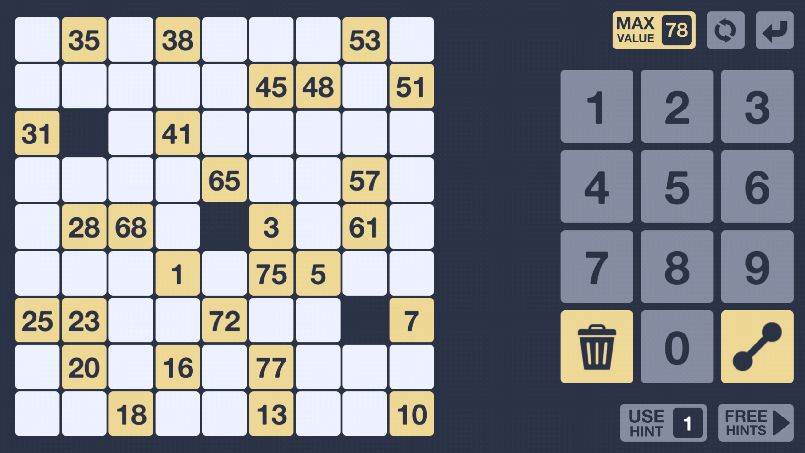
So. 2 unnecessary swipes left so far. 😦
I play the game by tapping in a white field and then tapping a number. But I have to take care. If I tap between 2 numbers (e.g. the space between 1 and 2) I have to start over. 😦
Otherwise a beautiful little game.
Note: I’ve written about usability before, in Danish.
